Table of contents
Summary
The new tools to create images through artificial intelligence are both delightful and frustrating to users. We tested two of the leading free systems, Stable Diffusion and Craiyon, and found both had a lot of room for improvement, in both user experience and image quality:
- The overall experience was mediocre. Both products received unimpressive overall scores in UserTesting’s QXscore benchmark.
- Interfaces were minimal, yet technical. In theory, generating an image with these tools is as simple as entering a few words. However, neither gave guidance on what made a good prompt, and one included an additional “negative prompt” that confused participants.
- The magic spell was broken by challenging subjects. Participants enjoyed using these tools, voluntarily spending extra time to refine their prompts. But they said images that included human elements like faces and limbs were off-putting. The image creation products need to either improve their output or set the expectation that scenes including people may be creepy.
These mixed findings add to an already substantial to-do list for AI image generation companies. In a recent survey of laypeople, researchers found that while participants saw the potential importance of AI art generators, they had little understanding of how they actually work. This lack of understanding caused user confusion in our study. The survey also found that people were concerned about the potential harm of using “deep fakes” to manipulate public opinion. AI images are off to a promising start, but they’ll need a lot more work to live up to the high expectations of the public.
What are AI art generators?
Picture, for a moment, a scene in your head. It can be anything you like: a breathtaking landscape, a close-up editorial portrait, a still life of fresh fruit in a bowl, or an astronaut riding a horse in the style of Andy Warhol.
Artificial intelligence (AI) tools — like DALL-E, Midjourney, and Stable Diffusion — trained on a vast corpus of images can now translate the vision in your mind into a downloadable image with a few short keystrokes.
These new technologies can produce incredible results, rivaling the work of human artists and photographers. AI generated artwork is now being sold by stock image dealers like Shutterstock, and has even won awards.
But if you’re new to this concept, how easy is it to get an output worth your time? And are there subjects it just can’t handle? To find out, we conducted a small benchmark study comparing two free public tools, Stable Diffusion and Craiyon.
Here’s what happened:
Neither tool had a great user experience
We used the Quality of Experience Score (QXscore), UserTesting’s validated measure incorporating behavioral and attitudinal measures of the user experience, to holistically evaluate each site. A higher score means a better experience using a 101-point scale.
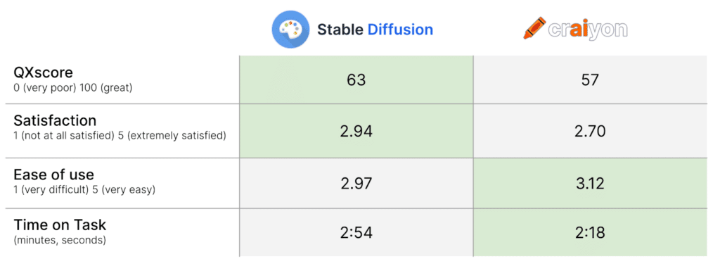
Neither experience was great. Stable Diffusion won the day with a QXscore of 63, compared to Craiyon’s 57. Judged against other sites in our database, this puts Stable Diffusion in an “average” range, but Craiyon would be considered “poor.”
For each site, self-reported task success rates were relatively high, and perceived ease and satisfaction were both rated similarly across tasks. Though Stable Diffusion had a shorter median task duration, getting a result took a long time on both platforms: more than two minutes!
Technical, opaque interfaces
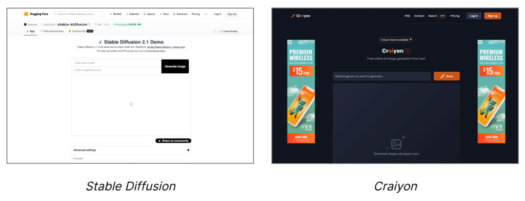
Both Craiyon and Stable Diffusion have relatively clean interfaces: a single-line text entry above a canvas where alternative image generations are displayed. Yet despite this surface-level simplicity, many interactions were characterized by confusing and technical messaging. You can see this in the clip below:
Unlike Craiyon, Stable Diffusion also allows users to specify things they don’t wish to see in the output image, in an entry called the “negative prompt.” However, this is nowhere explained in the interface:
Craiyon is ad-supported to keep its services free. But the number and placement of advertisements was so heavy that, at times, the interface itself was hidden, as you can see in this image:

The immediate feedback that Craiyon users received after submitting a prompt wasn’t always helpful. In the clip below, the participant misses the loading time indicator and is unsure if further input was needed. Other participants observed the loading time indicator moving backwards!
The servers powering Stable Diffusion often get overloaded, prompting the above error message. Some participants misinterpreted this, thinking they needed to adjust their wording or try something else:
Users lack accurate mental models
Another drawback of an ineffective interface is that users have few data points from which to infer how the tool works.
The concept of an art creation tool evoked, for some, a multi-stage process of building and blending layers of a scene, as is often the case in traditional tools like Adobe Photoshop. In the clip below, a participant verbalizes her initial thought process after unsuccessfully trying to use Craiyon this way. Another participant tried selecting and editing one of the alternatives presented.
Delight mixed with disgust
It seemed that participants genuinely enjoyed having an opportunity to explore AI art generators in this study.
Although the study was designed to take no more than 15 minutes, we observed average study durations much higher than that: around 28 minutes! We told participants that they could voluntarily adjust the phrasing and image output as much as they’d like — and judging from average task times between two and three minutes, it appears the majority did so. Some even left positive feedback at the end of the study, like one participant who said, “This was so much fun. I loved all parts of the process.”
Unfortunately, AI art generators handle some subjects better than others.
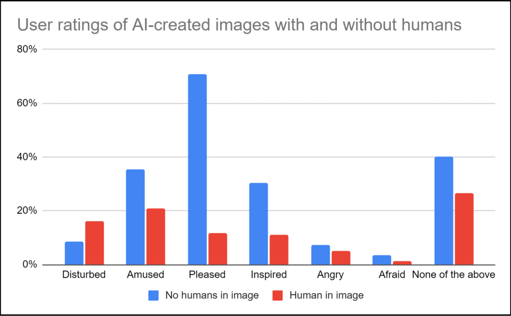
For example, when asked to recreate images featuring people, participants were disturbed by the tools’ inability to faithfully reproduce convincing human features like faces and fingers:
After each task, participants were asked to describe their reaction to the image by selecting from a list of words. Images containing humans were far less likely to attract positive comments like “pleased,” “amused,” and “inspired,” but were more likely to attract the comment “disturbed.”
How we generated our findings
Designing a benchmark study requires careful attention.
How did we choose Stable Diffusion and Craiyon? Both are relatively popular options that are freely available for the public to use without a login. We hypothesized that Stable Diffusion would produce much higher quality images than Craiyon, as it was trained on over 5 billion images compared with Craiyon (formerly known as DALL-E Mini)’s 30 million. In fact, while participants’ average satisfaction rating for Stable Diffusion images (2.94 on a 5-point scale) was higher than Craiyon’s, (2.70), the difference was modest.
We recruited a total of 72 participants in late December 2022 and early January 2023 to try out one of the platforms. We were interested in understanding the experience of novices, so we screened out folks who had spent more than three hours using similar tools. Even so, around 75% of participants reported some familiarity with the concept.
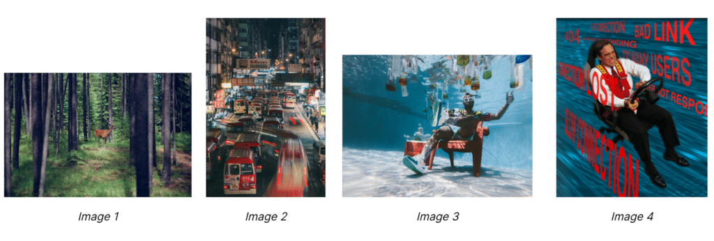
One’s imagination is the only real limit to what kinds of imagery can be made with these tools, but we wanted clean points of comparison between people taking our study. Before we exposed participants to the tool, we presented each of the four images above, one at a time in a random order. These images varied in subject matter and complexity of details, which allowed us to assess the breadth of these tools’ capabilities. Participants then described each image in detail. Writing this description is similar, in effect, to how one constructs a good prompt. So later, when we asked them to recreate each image using Stable Diffusion or Craiyon, we reminded them of the text description they provided as a starting point.
The bottom line
Like other emerging technologies, the UX of AI tools will need greater care before mass adoption can gain momentum. Thoughtfully measuring the experience in a benchmark study using UserTesting is a great first step towards doing just that, and can provide a roadmap for teams prioritizing improvements.
Thanks to Jamie Skjoldager for her significant contributions at every stage in this research, and to Lisa Stuhr for reviewing a draft of this article.
Robot image created by Craiyon.
The opinions expressed in this publication are those of the authors. They do not necessarily reflect the opinions or views of UserTesting or its affiliates.


