


 Share this article
Contents
Summary. Most marketing deliverables are sent “in the blind,” without any testing to verify that they resonate with customers. This wastes resources and risks brand affinity. Marketing teams are starting to use human insight tests to vet creative and other deliverables — like messages, web content, social posts, and videos — in just a few hours. In this article we’ll teach you how to run marketing content tests, and show what you can learn from them.
A lot of modern marketing is done in the blind
When marketers create a new brand or run a multimillion-dollar ad campaign, they generally do multiple rounds of research and revision before it launches. There’s enough lead time that you’d be foolish not to do extensive discovery and testing.
But the day-to-day deliverables that make up most digital marketing can’t be tested the same way. Things like social posts, email messages, and web content are often deployed rapidly, without enough time or employee bandwidth to test them using traditional research techniques. Instead they’re usually sent in the blind, without prior vetting with customers, and then you use analytics after the fact to figure out which ones worked and deserve further investment.
Surveys of marketers show that more than half of marketing materials are never vetted before delivery, and the ratio is even worse in some categories:
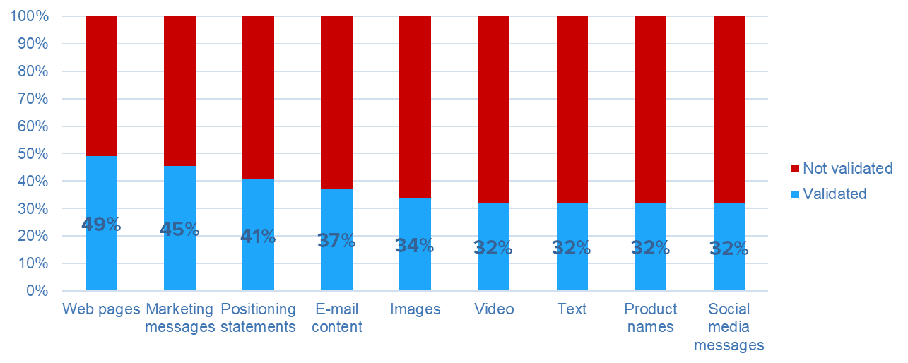
Percent of marketing deliverables that are validated through customer tests before they’re delivered. In every category the majority of deliverables were never tested before delivery. Source: Marketing managers responding to the CX Industry Survey, UserTesting.
Taken as a whole, all of this guessing creates high risks and inefficiencies for a marketing team:
- Some of your materials will fail to resonate with customers, meaning you have wasted that money and possibly weakened your brand in the process.
- Analytics doesn’t give you enough data to iterate decisively on your deliverables. If customers don’t respond to it, why not and what needs to be fixed? You have to guess at the answers.
- Analytics can’t always measure the effectiveness of a single deliverable, especially if it’s bundled into a campaign. So some ineffective material may never be identified.
Although the impact of any single marketing deliverable is small, we create so many of them that they have a very big cumulative influence on a company’s success. It’s hard to say exactly what percent of marketing deliverables fail to hit the mark, but the A/B testing community estimates that up to 90% of the ideas they test fail. So the amount of risk and wasted effort is enormous.
To reduce that risk, marketing teams are beginning to use human insight tests to get fast feedback on marketing materials. Although marketers can’t wait weeks for a research study, you can usually wait a couple of hours to get feedback. The same technology that makes it easy to get fast feedback on an online shopping cart also makes it easy to get fast feedback on almost any marketing content.
This article will show you how to use a human insight system to vet your marketing material. As an example, we’ll test some images, but the same process could be applied to video, ads, copy, and anything else you can display on a screen.
The test: Choosing the cover image for a vacation catalog
In our example test, we imagined that we were in the marketing team of a travel firm that sends printed catalogs to its customers. The team can’t reach a consensus on the best image for the cover of the catalog, and we’re up against a tight deadline to send the artwork to the printer. How do we make a better-informed choice between the images?
Here are the three candidate images:

This one shows a typical setting at a vacation resort near Lake Placid, New York. It’s not spectacular, but we expected people to find it restful.

The second image shows New York’s Central Park in Autumn. We expected that it would appeal to travelers who like urban adventure.

The third image has the most spectacular scenery. Before the test, we believed that this image would have the strongest appeal.
Your goal in a test like this is not to choose the image for you, it’s to surface the emotions and other reactions people have to the images, so you can make a better-informed decision. In the test you show people the images and ask for their immediate reactions. Then you follow up with more specific questions about issues that you’re wondering about. For example, for a travel picture we might ask, “Would you want to visit this place, and why or why not?”
You could run this as a researcher-led test (in which you’re online with the contributor, asking them questions directly). But since we’re talking about a decision that needs to be made quickly, we’ll do this as a self-guided test, in which the contributor is recorded while they respond to pre-written questions on their own. With this approach, you can get results in a few hours, and you also minimize the personal time you spend on the project. The whole idea is to structure the test so you can do it routinely anytime you’re creating a customer-facing item.
This particular test took 59 minutes from launch to completion of the final video. Additional time was needed to analyze the results, but the whole process was easily completed in a single afternoon.
At the end of this article, we’ve appended the test plan we used for the study, so you can copy and modify it if you want to.
What we learned: The response to an image is surprisingly subtle
As often happens in this sort of test, we were surprised by the reactions. We thought people would respond to the images as if they were scenery, and tell us which one was the most visually appealing. Instead, we learned a lot about the implications that people read into even small nuances of a photo.
For example, we thought the Lake Placid image was the most boring image visually, but many participants liked it a lot. They pictured themselves sitting in the chairs and maybe paddling on the lake. But some people noticed the clouds on the horizon (which we thought were decorative) and worried that there might be rain during their vacation.
We assumed the second image, from Central Park, would immediately say “New York” to participants. But many people didn’t recognize it, and instead reacted to the color scheme and relative lack of people in the image. It seemed to give a melancholy feeling to some participants.
The third image, showing a mountain lake with a hiker, was the biggest surprise. We thought most people would be thrilled by the drama of the image, but many of them were turned off because of their personal feelings about being in that situation. Many people imagined themselves as cold and lonely, with nowhere to get a good meal or a drink. Even the people who liked the image did so not because of the scenery, but because of what they imagined they would do there. For example, a fisherman was deeply enthusiastic because he pictured himself catching a fish in the lake.
These clips from the test results show how some of the participants reacted. Listen to not just the things that people say, but the emotion in their voices:
Our most important finding was that choosing an image wasn’t nearly as straightforward as we thought. We imagined that the images were decoration, but in reality they triggered stories in the minds of the participants. Those stories were easy to understand after the contributors explained them, but were not intuitive to us ahead of time. With the investment of just a few hours, a real-world travel agency could have made a much better-informed decision about the right cover image, as well as the other imagery in the catalog.
Conclusion: It’s not just for images
You can apply this same fast feedback technique to any marketing material that can be displayed on a screen, including social posts, videos, emails, and text. There’s no longer a need to send any marketing deliverable in the blind; we’re entering a new era in which all marketing can be vetted, and optimized, before it goes to customers.
Additional reading
Content testing and measurement
Templates:
Appendix: The test plan
Here’s the questionnaire we used for the test, with some comments in [brackets]:
Screener: Contributors must have taken at least one vacation in the previous 12 months.
Introduction: A travel company is trying to choose the cover picture for its fall catalog. We need to choose between three possibilities, and we’d like your help. We’ll show you each image, and ask you questions about it. First, we’ll start with a couple of background questions…
1. On average, about how often do you go on vacation? [Verbal response]
2. Where did you go on your most recent vacation? [Verbal response]
[Display the first photograph. For convenience in this test, we linked to images that we found online. But a good human insight system will let you host the images within your test, so you can keep them confidential. This is an image from the Lake Placid region of New York. https://reesephoto.files.wordpress.com/2012/10/lake-placid-region1.jpg]
3. Please look at the photo, and then take a couple of minutes to answer these questions:
- How does this image make you feel?
- If you went on vacation to this place, what do you imagine it would be like? What activities would you expect to do there?
- Would you like to visit this place? Why or why not?
4. If you received a travel catalog with this picture on it, do you think you’d open it? Why or why not? [Verbal response]
[Display the second photograph. It’s an image of New York City’s Central Park. http://naomiloomis.com/wp-content/uploads/2015/09/falltravel.jpg]
5. Please look at the photo, and then take a couple of minutes to answer these questions:
- How does this image make you feel?
- If you went on vacation to this place, what do you imagine it would be like? What activities would you expect to do there?
- Would you like to visit this place? Why or why not?
6. If you received a travel catalog with this picture on it, do you think you’d open it? Why or why not? [Verbal response]
[Display the third photograph. It’s a mountain scene by photographer Jack Brauer. https://www.mountainphotography.com/images/large/201109_iceLakesAutumnHike.jpg]
7. Please look at the photo, and then take a couple of minutes to answer these questions:
- How does this image make you feel?
- If you went on vacation to this place, what do you imagine it would be like? What activities would you expect to do there?
- Would you like to visit this place? Why or why not?
8. If you received a travel catalog with this picture on it, do you think you’d open it? Why or why not [Verbal response]
9. Which of the three images did you like best, and why? [Verbal response]
Photo by Immo Wegmann on Unsplash
The opinions expressed in this publication are those of the authors. They do not necessarily reflect the opinions or views of UserTesting or its affiliates.


